Network of business women in Sweden.
Brand refreshment in 2010.
The assignment included a new refreshed logo, a new website, postcard prints and roll-up.
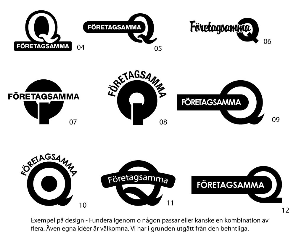
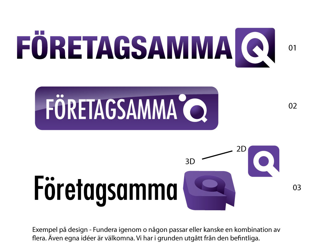
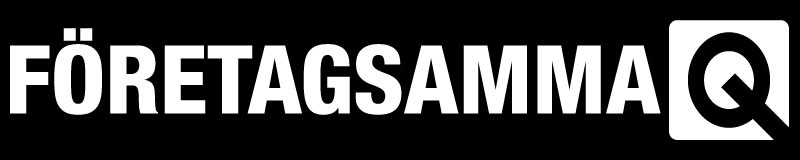
I started to give some basic examples of a logo, revolving around the letter "Q".
In Sweden Woman translates to "Kvinna" and replacing the K with Q, you will still have the same pronunciation.
In addition the genus symbol of woman is not far from the letter Q.
The Swedish word "Företagsamma" translates to enterprising and industrious.
These were all things that was already in place by the organisation when I started the redsesign. The existing logo was a very simple text logo.
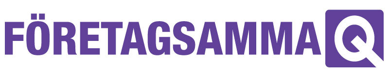
Final result logo
Here is the final result. I delivered this in a plethora of formats, including the icon separated from the text.


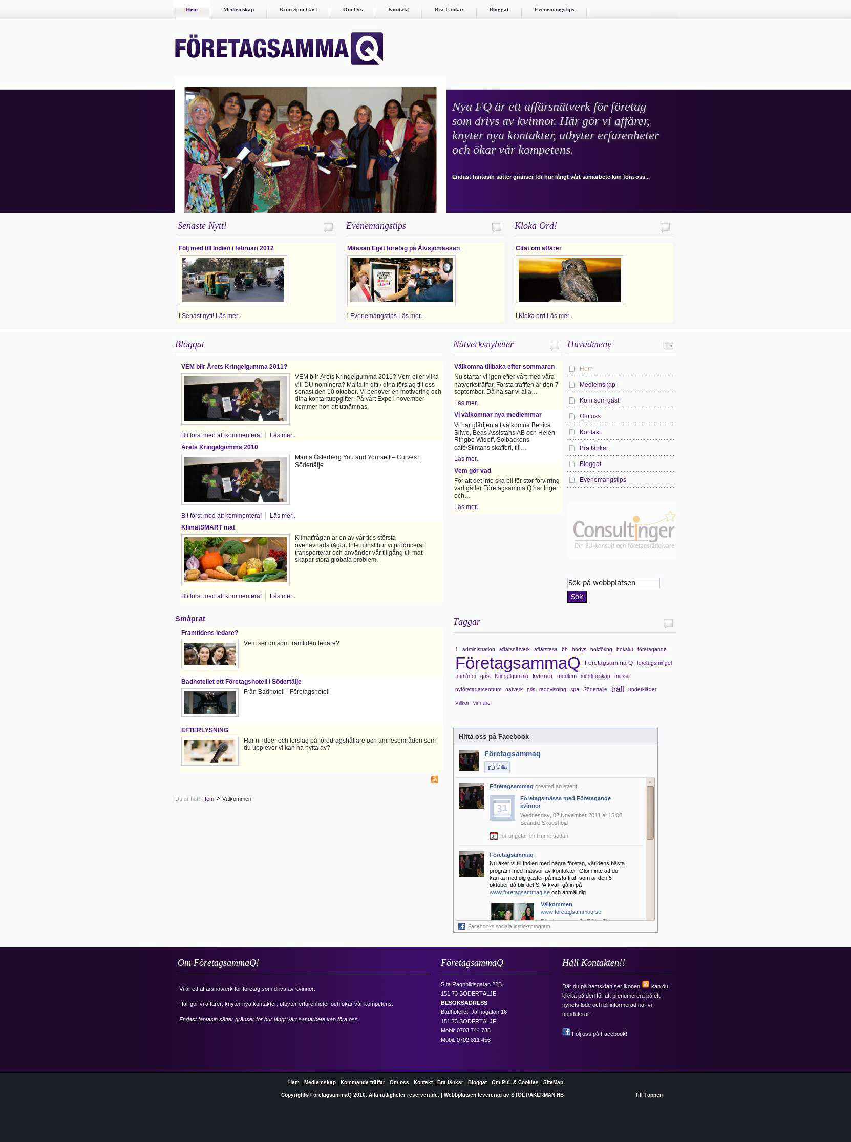
Website
We then started working on the website. We selected Joomla CMS for the task but could equally have selected WordPress.
We wanted something that had a rigid structure and were we could easily implement new functionality. Main reason being that any new administrators would likely to be knowledgable in HTML and needed to be guided by the system.
Client provided content in form of articles and images. My business partner added it into the site and installed the functions.
Here is the final site in 2010:
Postcards
In order to spread the word about the new site and redesign, the organisation ordered postcards.
Since the layout was rather simple, I decided to use Photoshop before Indesign and after creating some suggestion for front and back, I produced print ready PDF's and sent it to print.
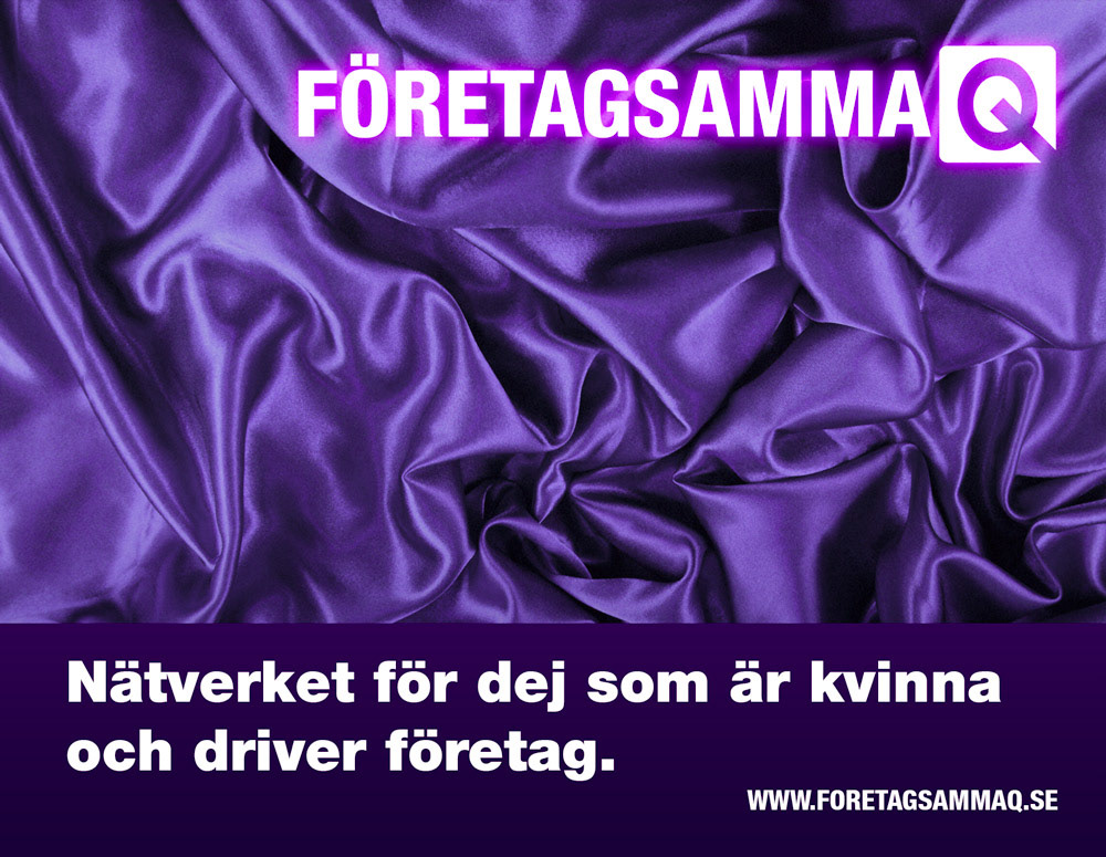

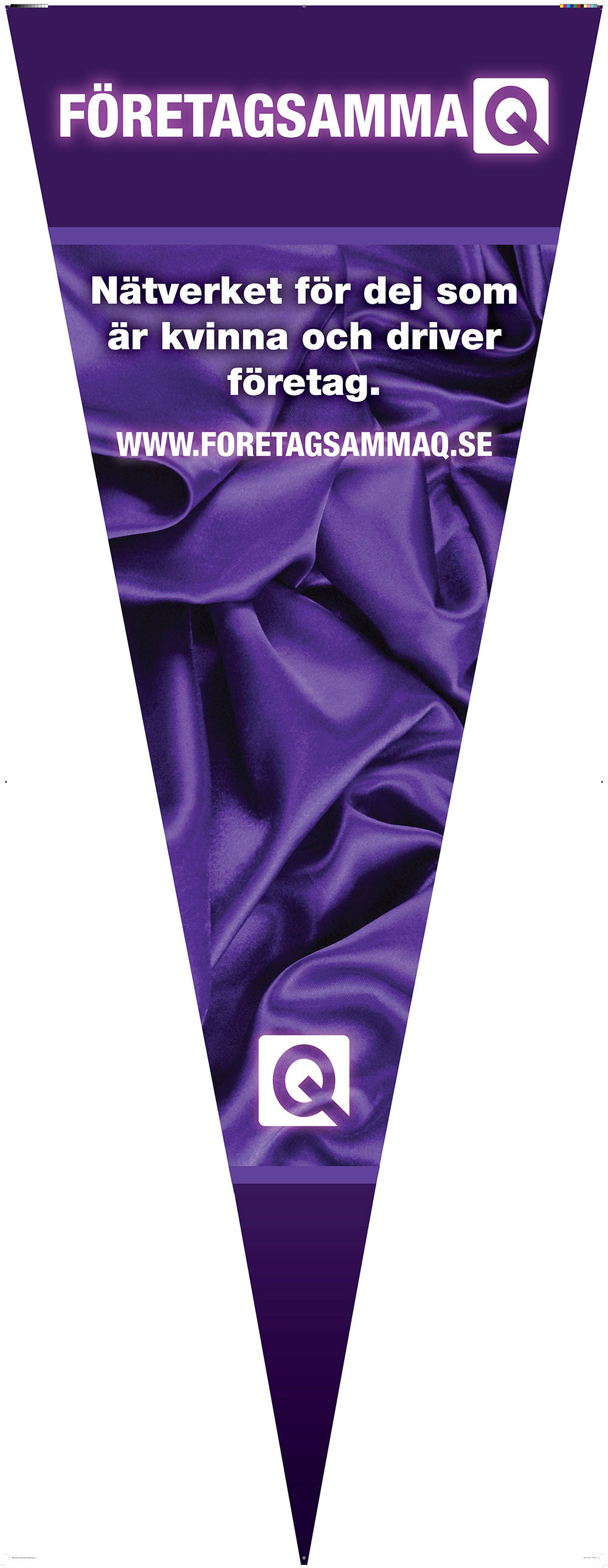
Roll-Up
After a couple of months the organisation was attending a business fair and thus needed a printed 2,5m high roll-up.
The challange was that the shape was a hanging flag and to create a suitable layout in Indesign, proved to be a little tricky, but solvable.
I happily created it for them and sent the PDF to print.